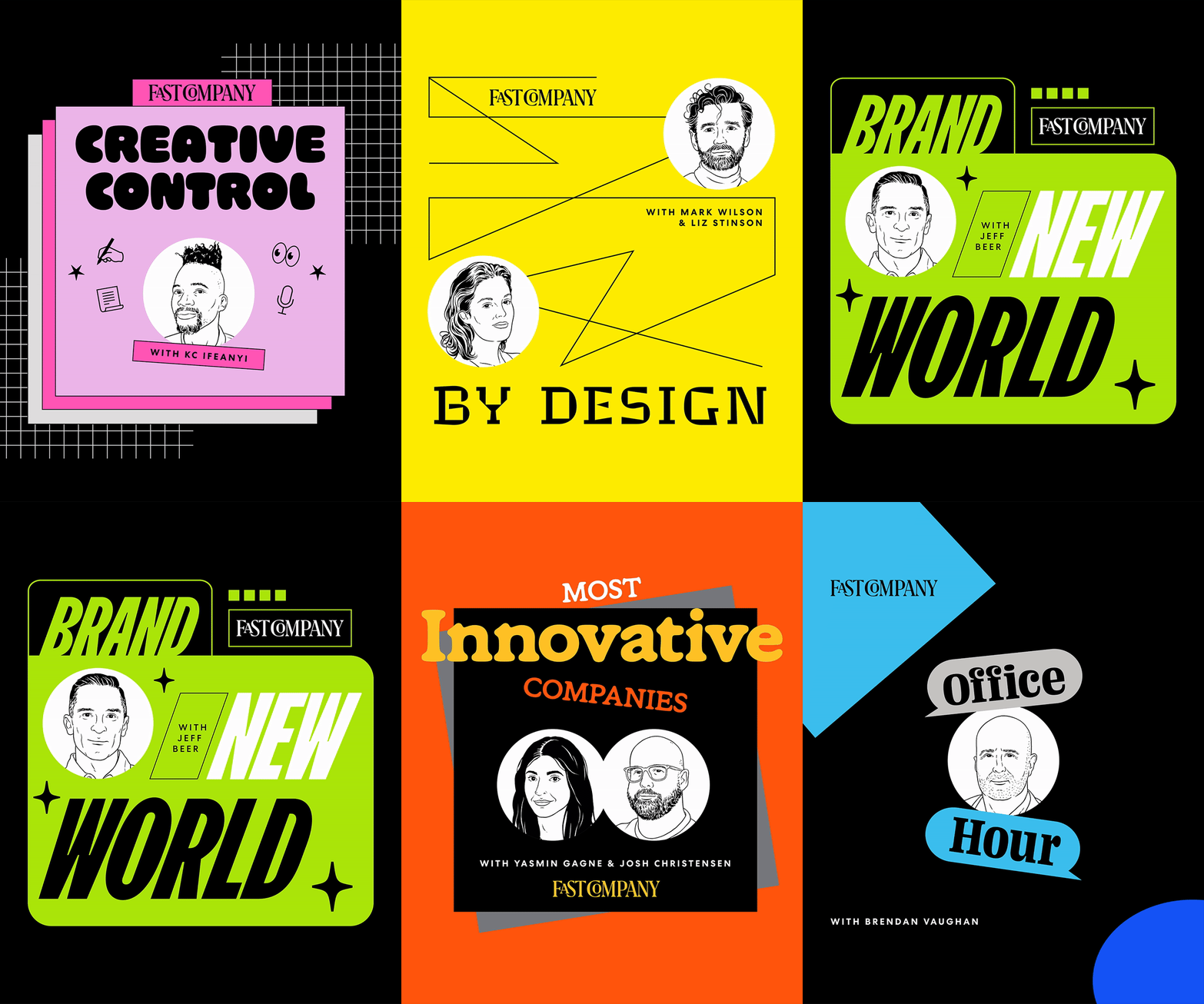
The Fast Company Podcast Network
unpacks the latest in worlds of business, technology, design, work life and innovation.
For the last half of my fellowship at Fast Company, I primarily focused on this major rebrand of FC’s podcast network. Stick around and keep scrolling to see how I did it!
What actually
goes into a
branding project?
-
It all begins with an idea! Define your goals and strategy. The overarching goal for this project was to draw in a wider range of listeners, generating new traffic for Fast Company. For strategy, we identified the elements for each show’s branding, allowing a united design system from the jump. In my case, this included host illustrations, a unique typeface & color palette per show, and the Fast Company logo. From there, the fun really began.
-
This project went through roughly three phases. First came the initial art direction pitch, then came the first round of designs, and lastly, the final execution. Typography selections and getting our portrait illustrator started were the most crucial steps, as it set the tone for every decision that followed.
-
Observation and evaluation are constants in the life of a designer. Quality checking your progress between partners, stakeholders, and the creative director is how you deliver quality work. May seem obvious, but it’s necessary and shouldn’t be skipped. I like to think of this phase as going through the deliverables with a fine-tooth comb.
-
Alas! It’s time for your work to enter the real world! After you hit your deadline, sit back and watch how your project is interacted with. Are there any notes you can make to elevate your process in the future? This is a good time to reflect, and to also give yourself a pat on the back. This moment happened for me when Fast Company launched the podcast rebrand to Instagram.
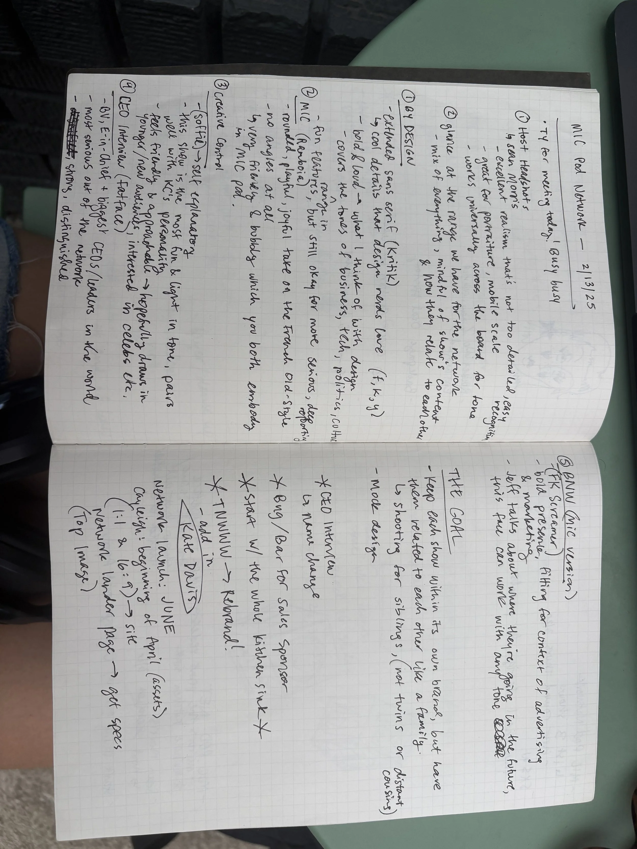
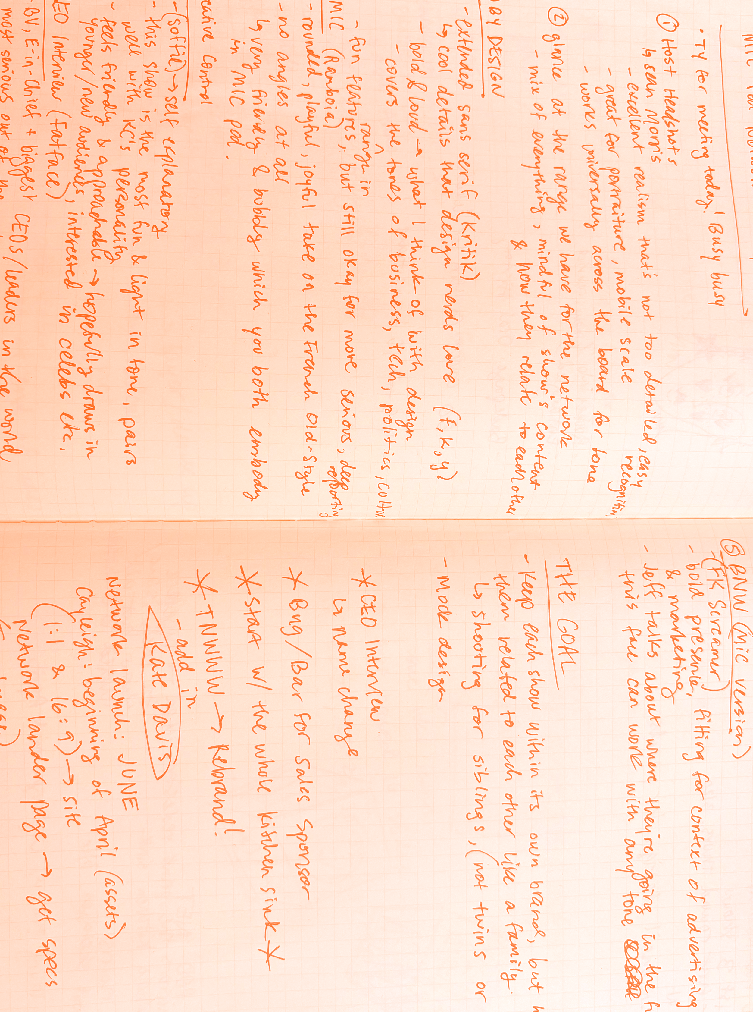
Phase 1: research.
And lots of it.
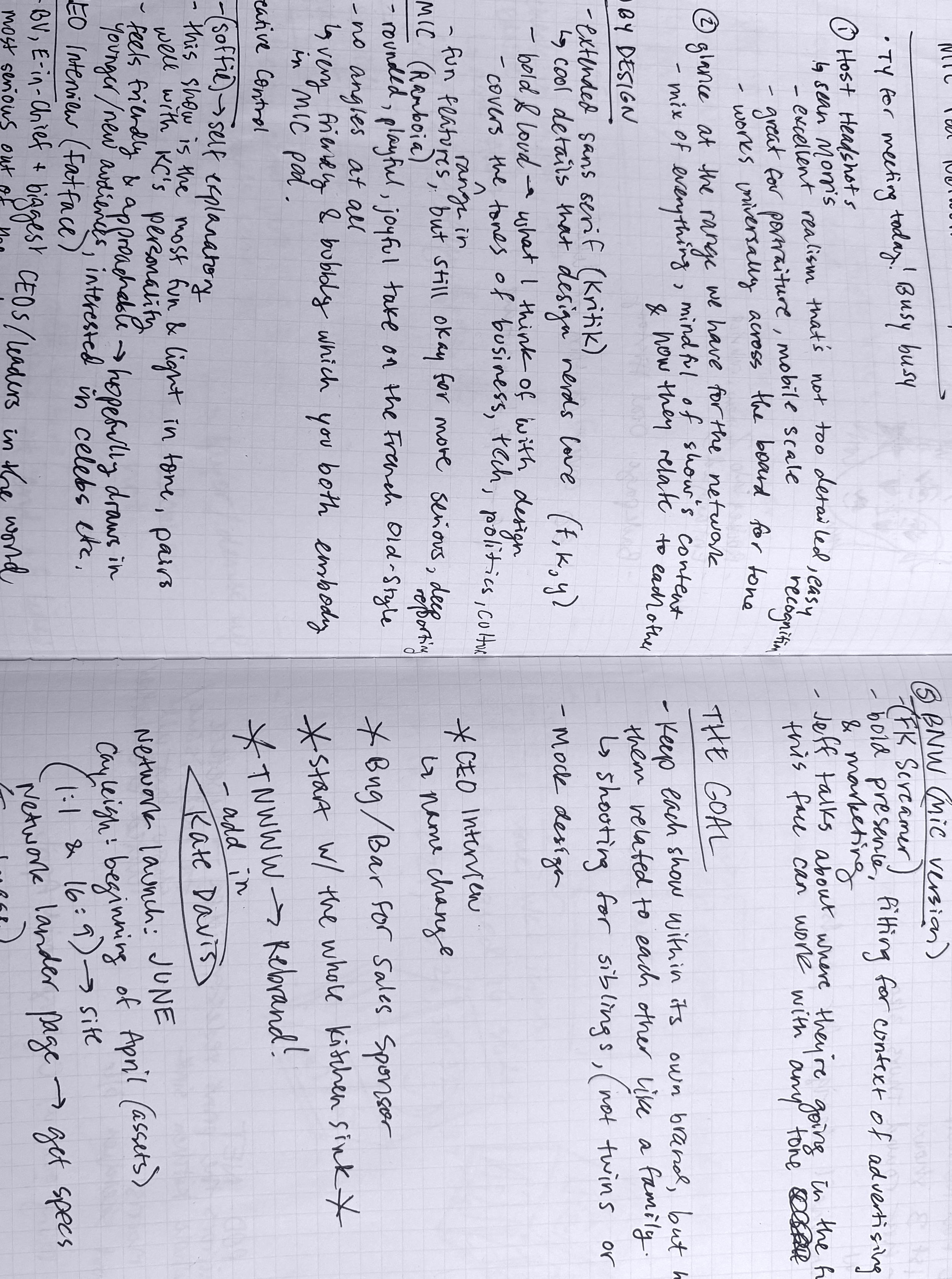
I spent a few weeks honing in on each of the podcasts’ content, and planning how to tie them together—which would prove to be my biggest challenge.
Because how does one create individual, unique branding systems for each show, yet make them feel like they’re apart of the same family?
A visual metaphor that grounded this thinking through the entire project, was thinking of the shows as cousins, but not siblings— never twins.
I worked toward the first presentation, where my goal was to get stakeholders on board for the design direction, pitched in the video below.
After presenting, I gathered initial reactions and feedback which would bring me to the next phase.
Next phase:
everything but
the kitchen sink.
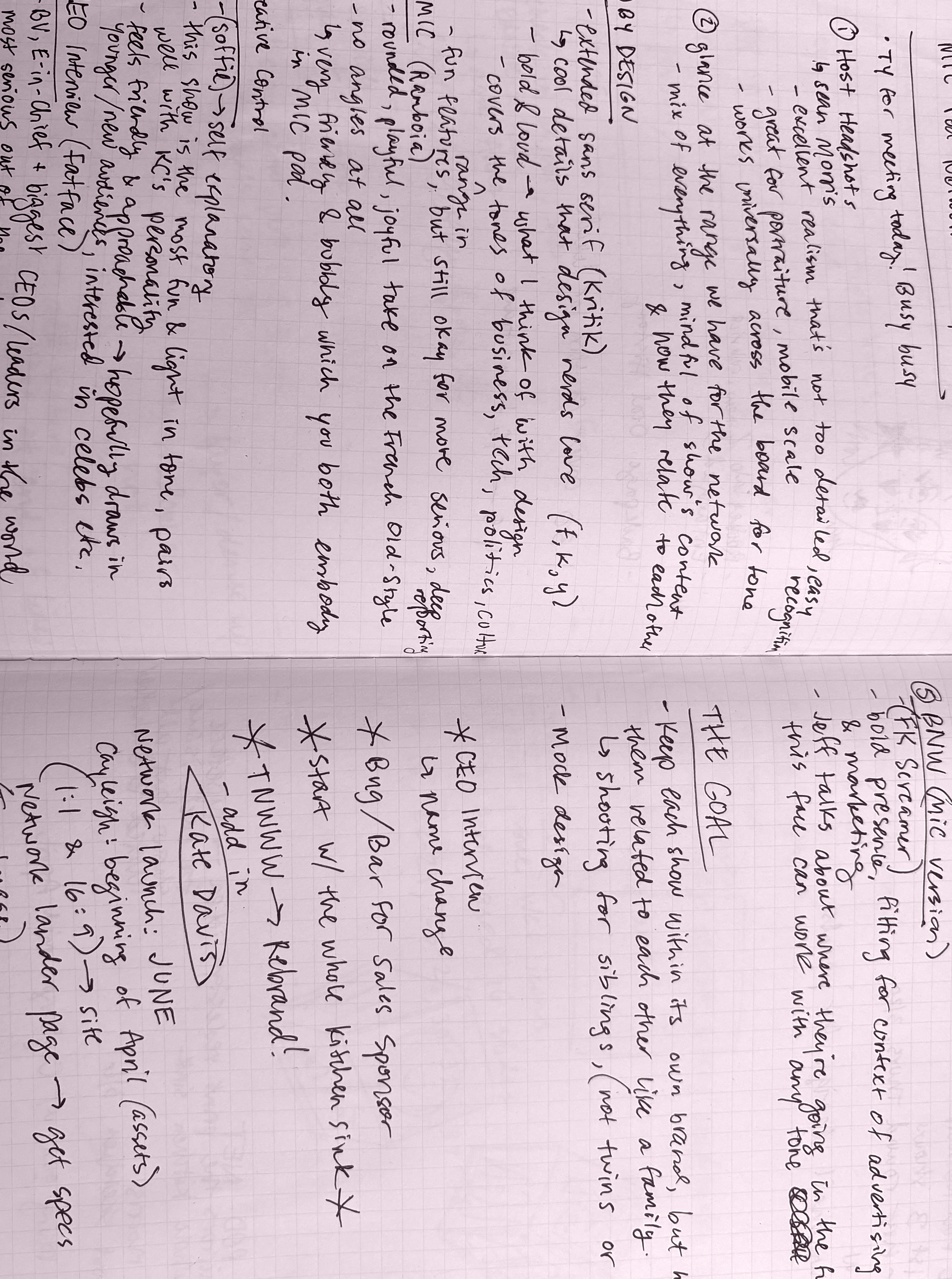
Once it was approved to dive into design, I was encouraged to exercise every creative idea. We didn’t want to get too hung up on the details this early—so I largely focused on composition and typography.
My creative director Mike coined this design phase “everything but the kitchen sink”—
to start with everything and narrow down from there. Take a look at some early designs below.
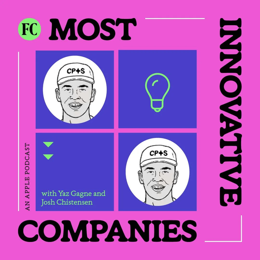
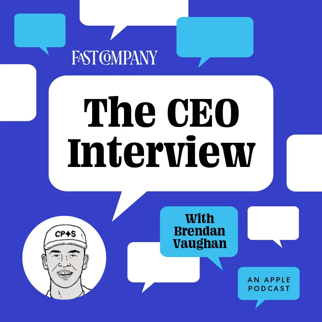
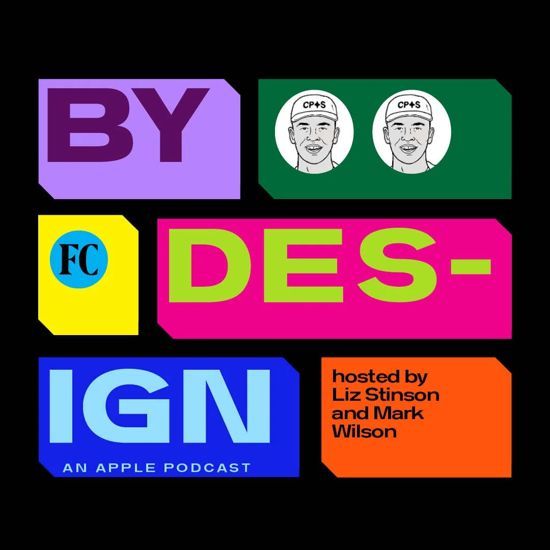
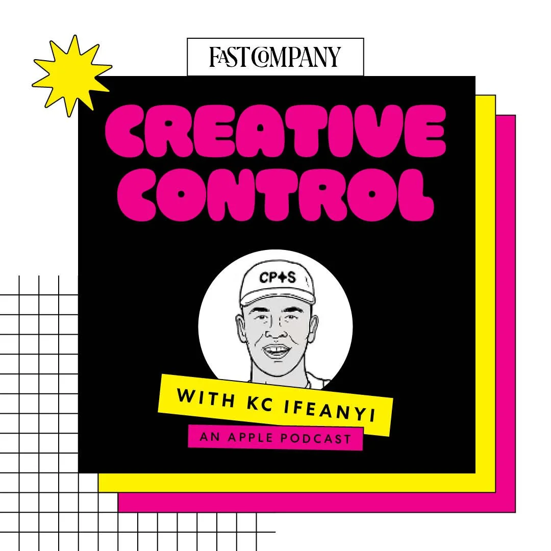
Color!
〰️
Iterate!
〰️
Color! 〰️ Iterate! 〰️
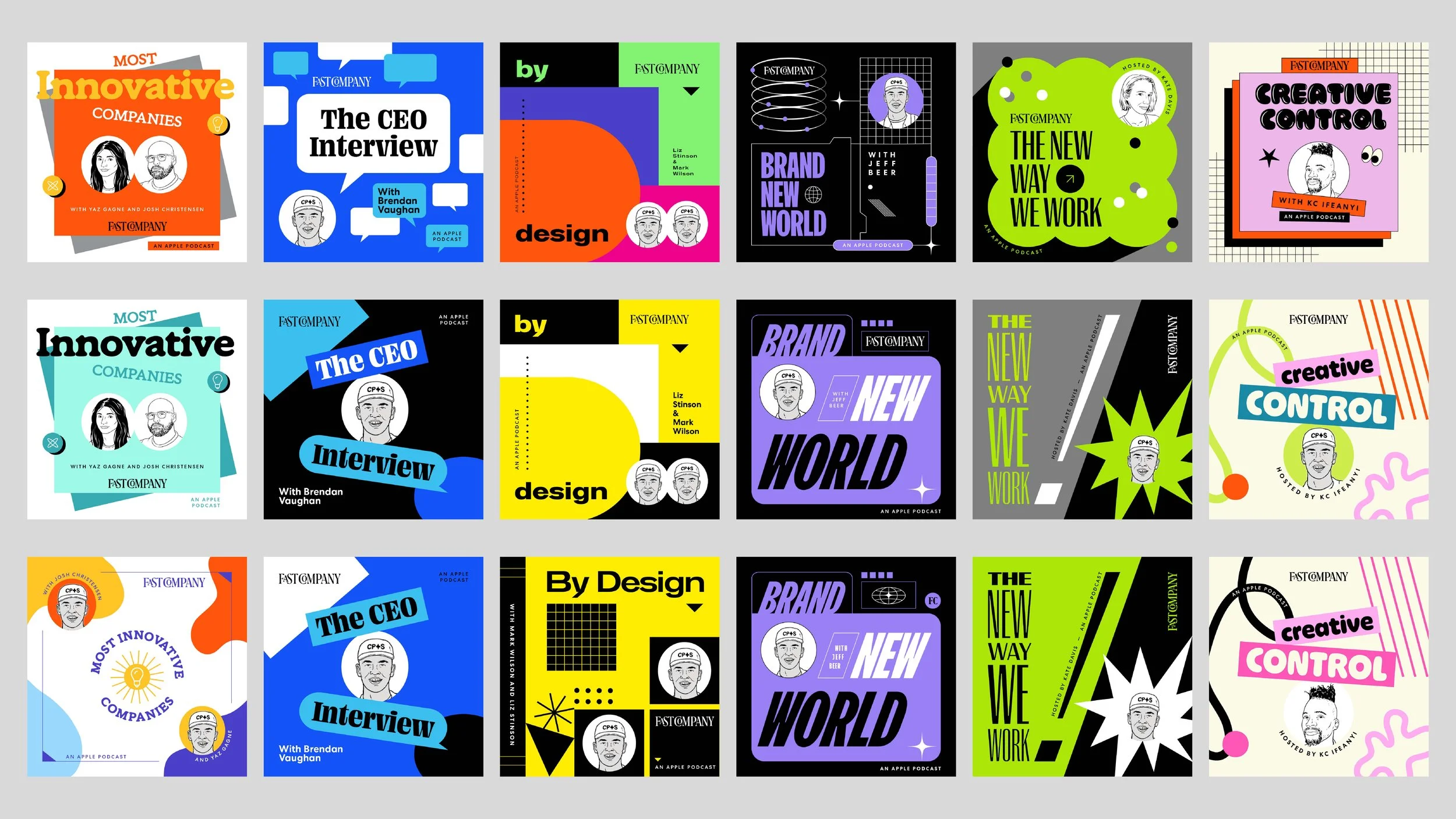
After some more iterating and editing, I collected my best designs to pitch at the next presentation, pictured below.
To my delight, stakeholders reacted positively! But there were still some edits needed, such as color and the likeness to a few hosts’ headshot illustrations. That portion of this project presented an exciting opportunity to work on my art directing skills, one-on-one with our commissioned illustrator, Sean Morris.
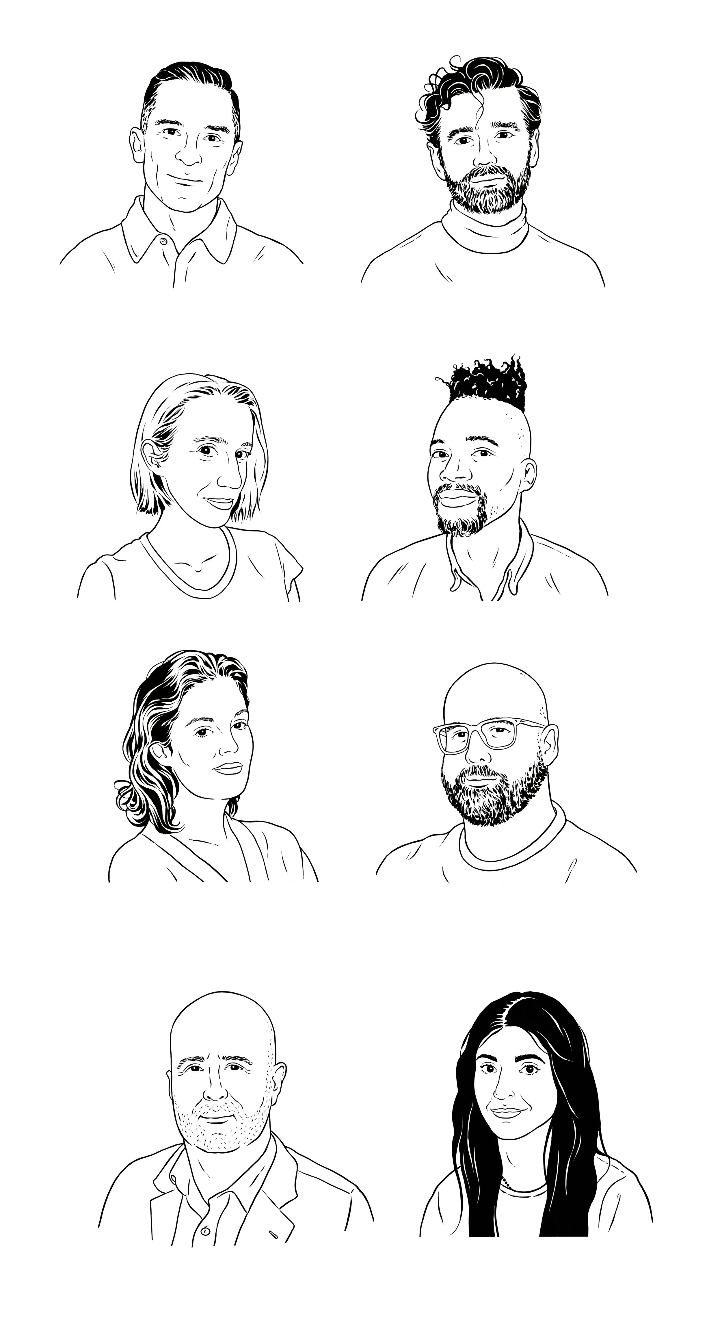
After many, many emails, and many printouts marked up with red pen, we landed our final host headshot portraits! Sean crushed it.
The final phase,
home stretch.
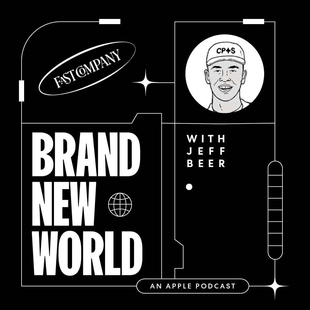
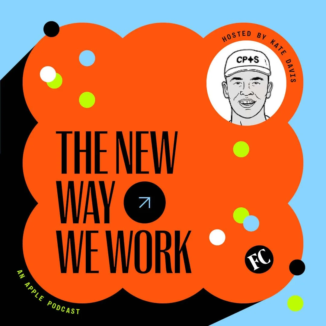
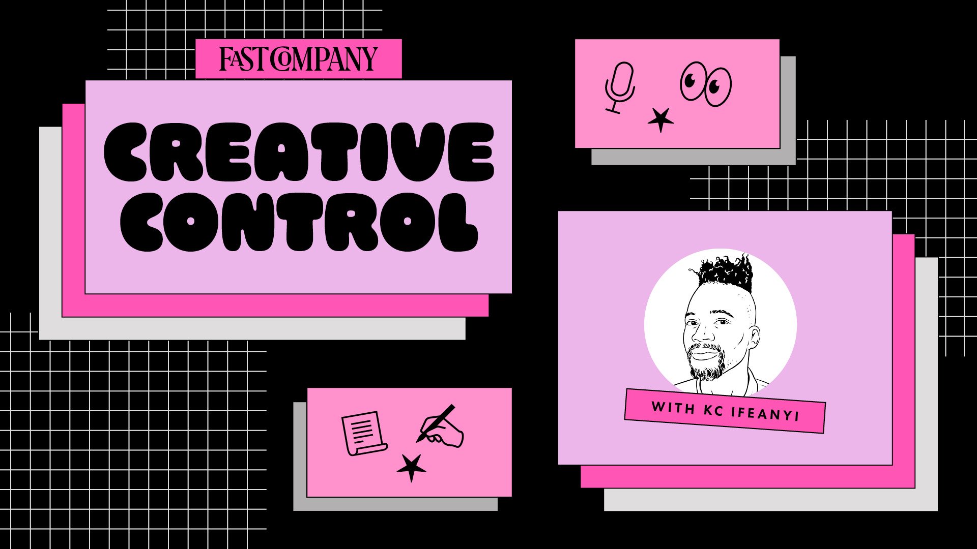
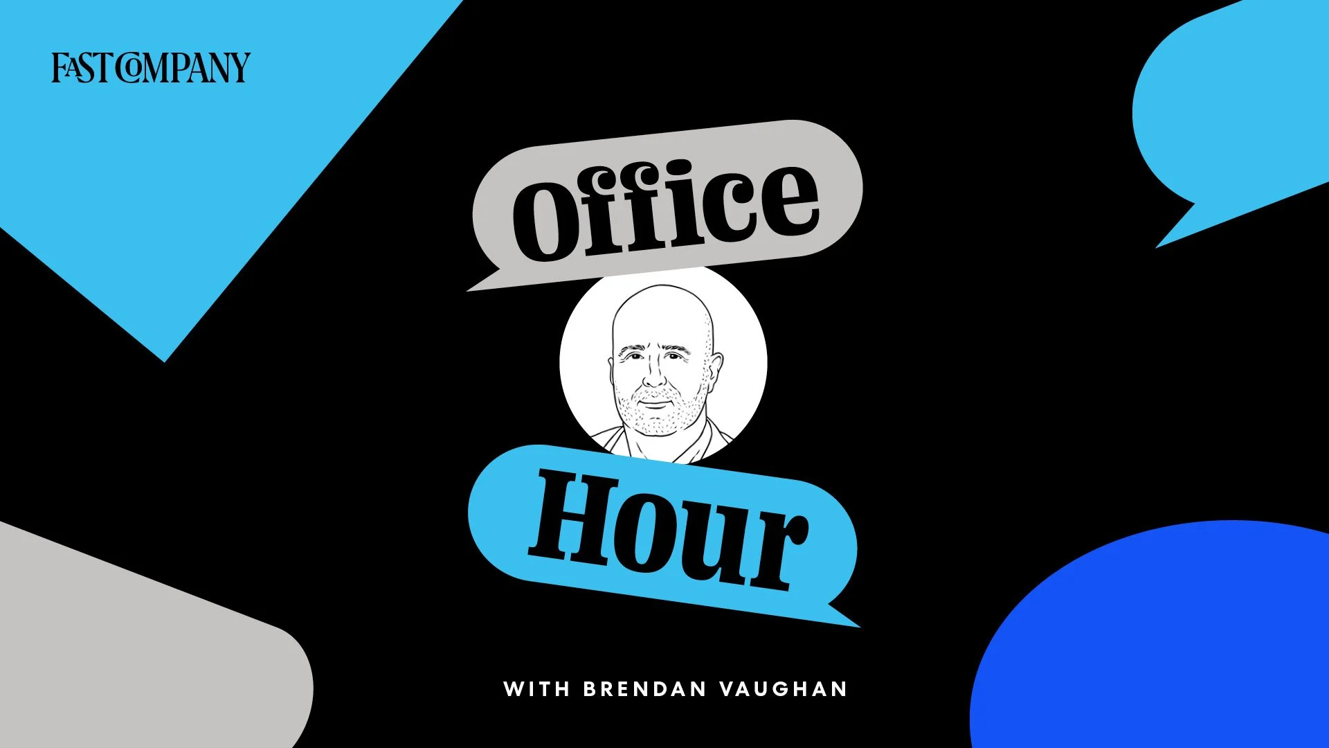
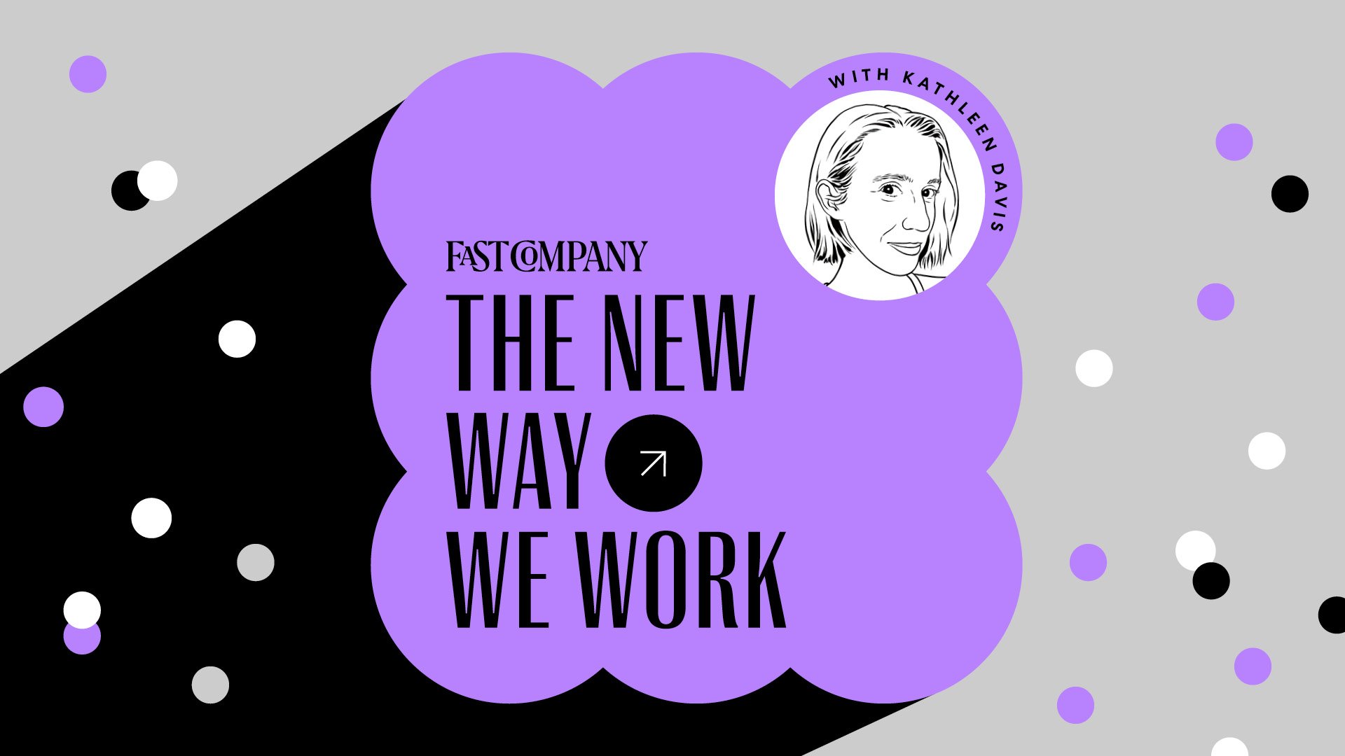
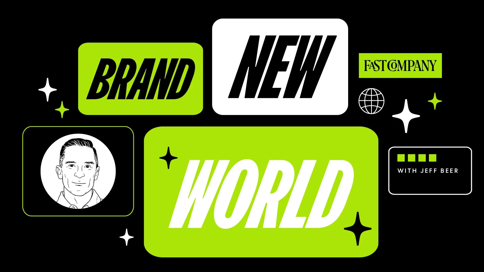
After the last presentation, I knew what the final needs were. We had a game plan, and, when the time came, went through everything with a fine tooth comb before handing the rebrand over to be implemented. Below is the final asset suite of deliverables!
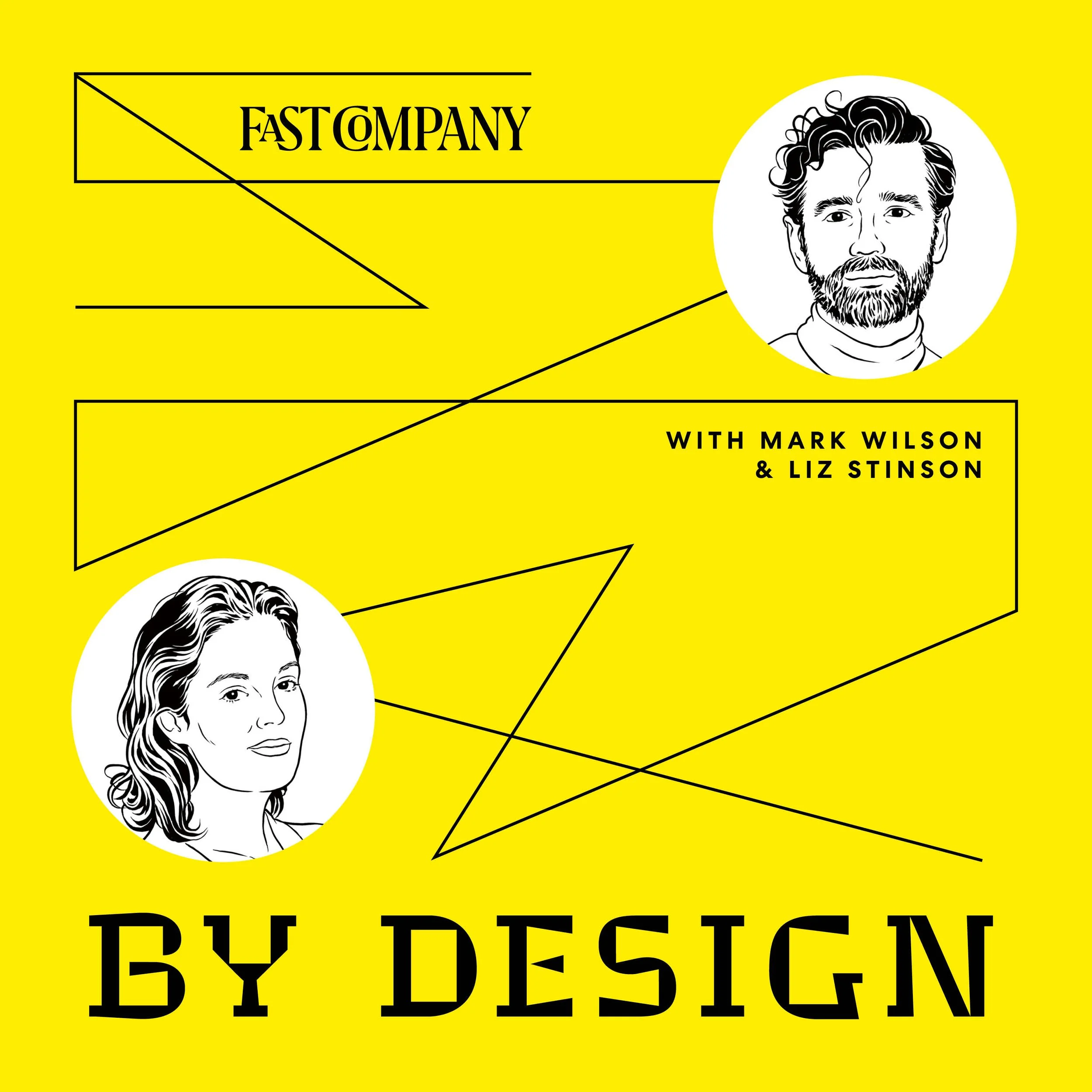
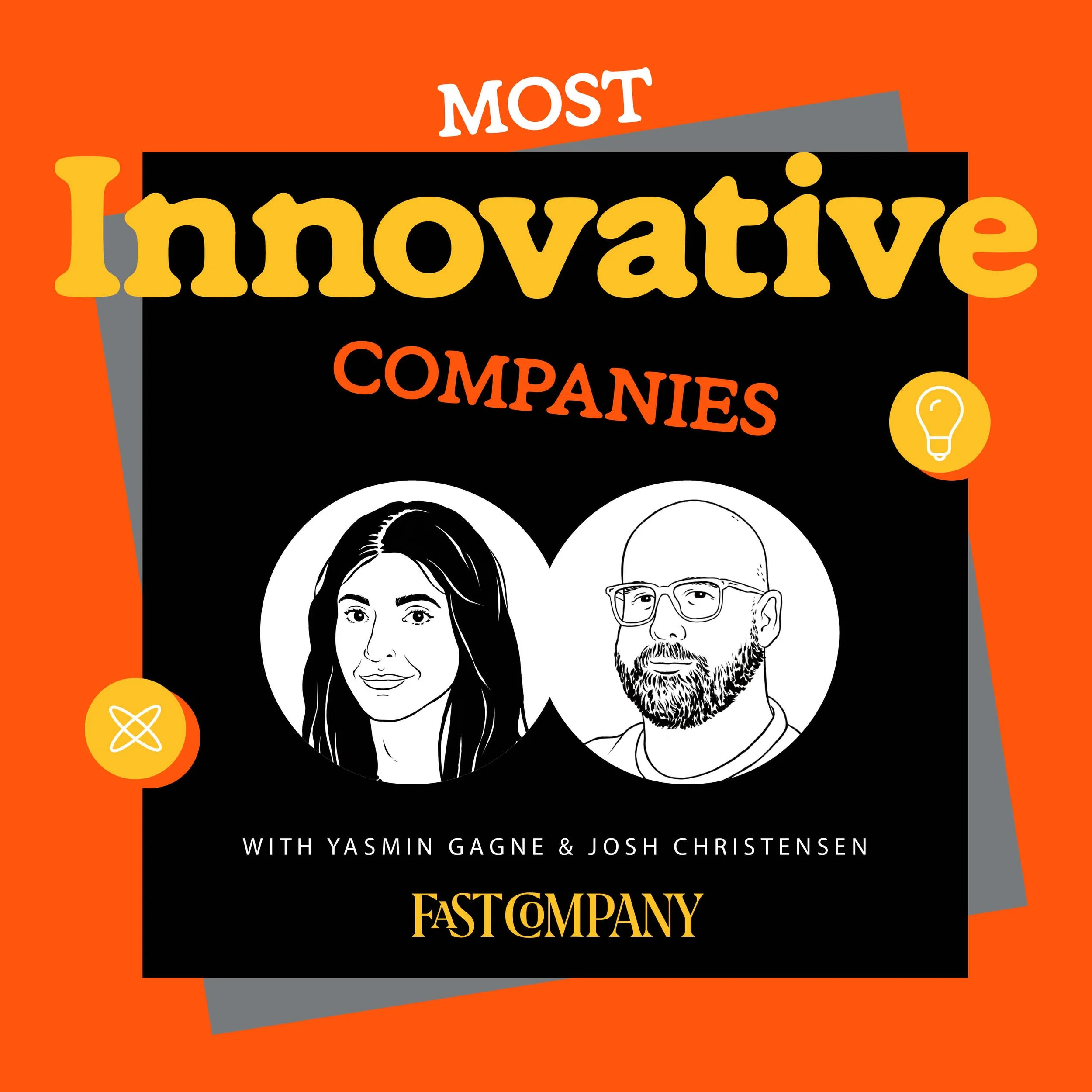
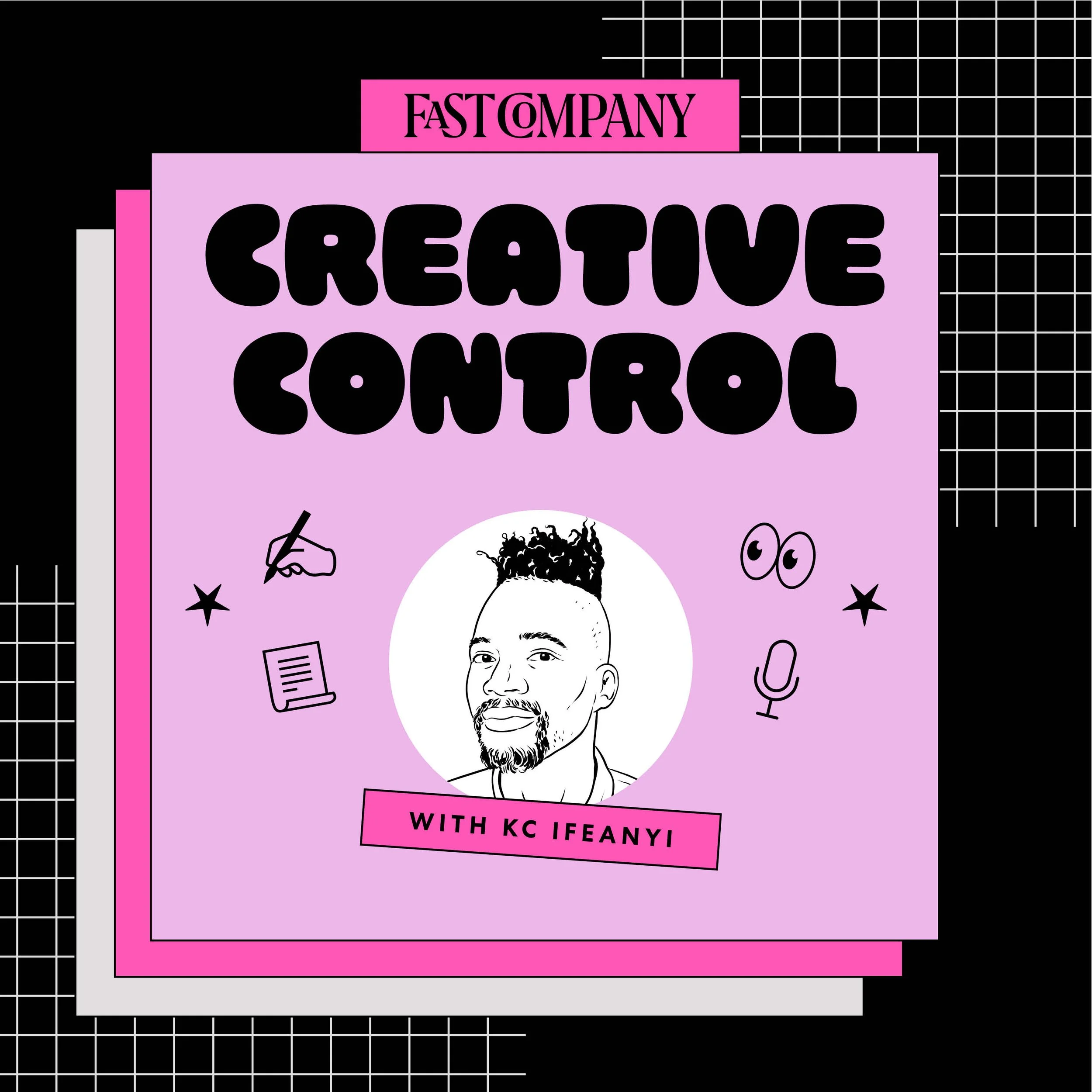
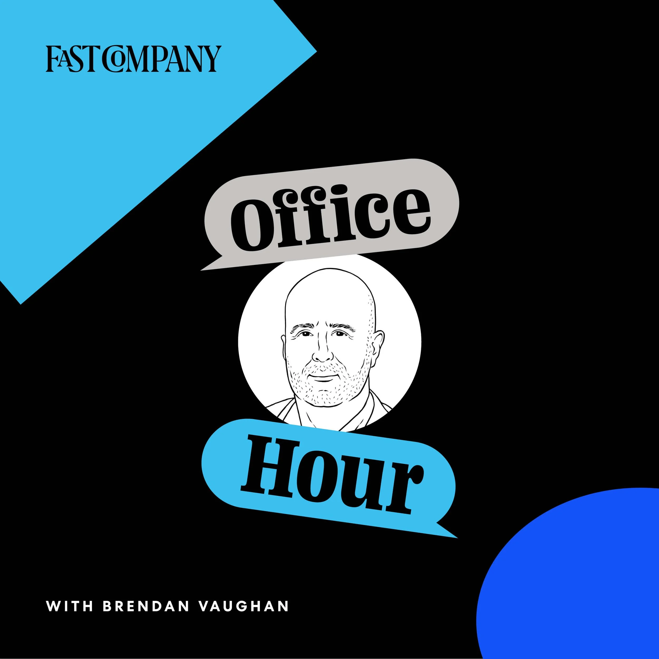
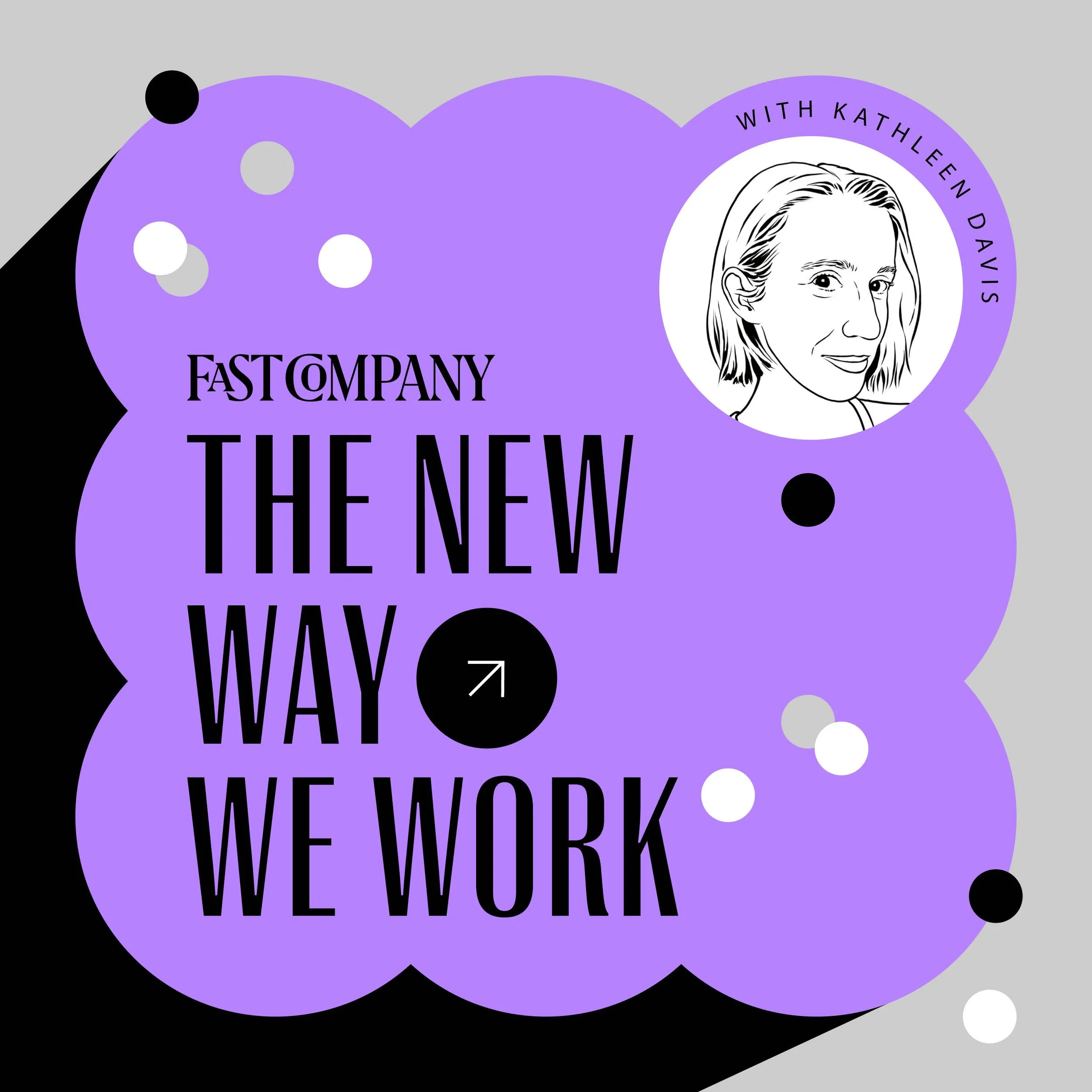
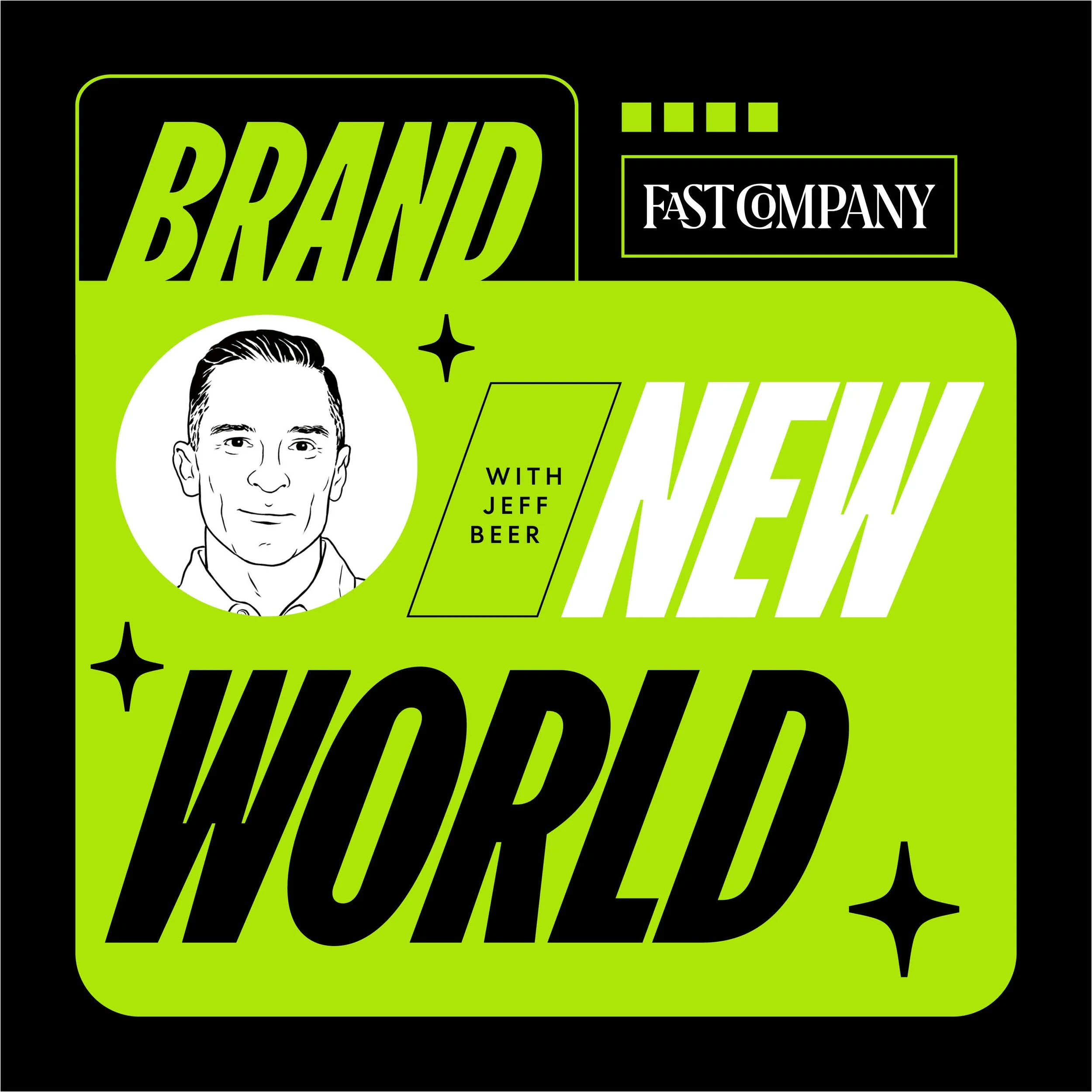
1080×1080 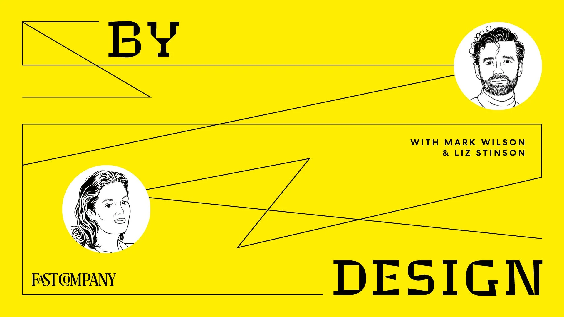
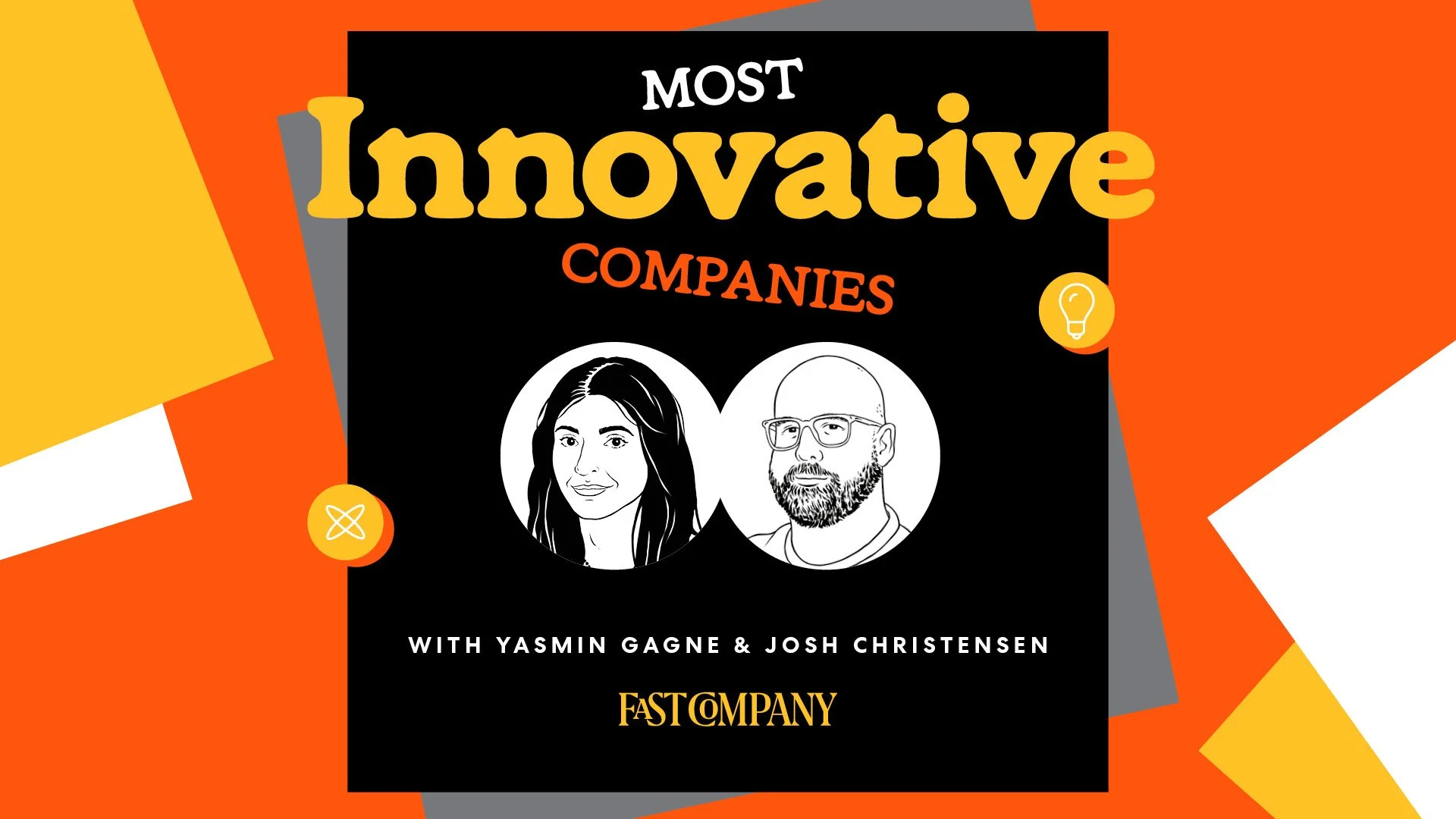
1920×1080