The latest innovations in design, brought to you every weekday.
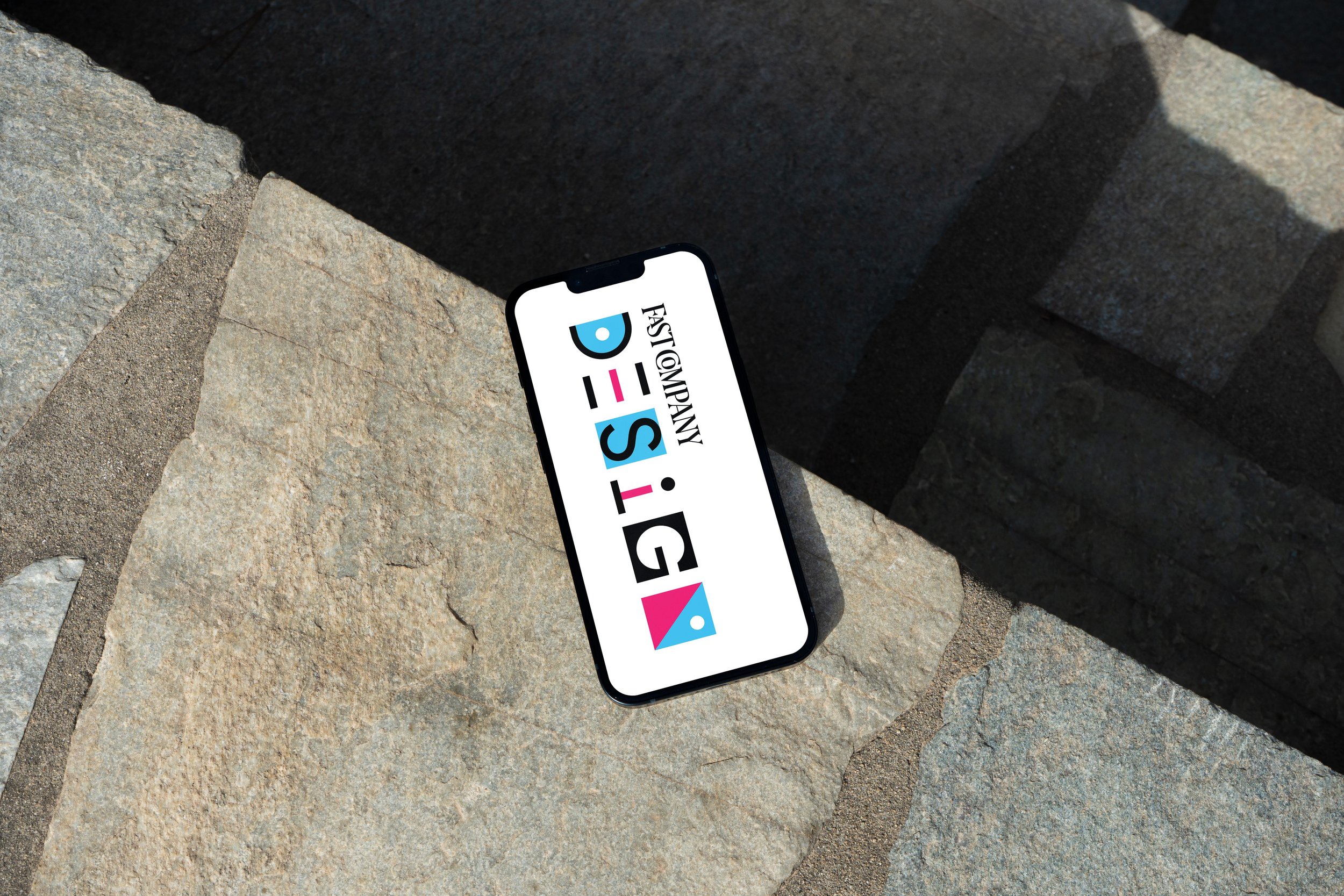
Broken down from Fast Company’s brand typeface “Centra”, I chose to create a custom geometric logotype. I wanted this newsletter logo to deliver the order,
but also the play comes with design.
2 presented directions:


3 presented color palettes:


After presenting to stakeholders, Logo B was the winner. The final color decision was also a cheeky nod to the first half of the classic acronym CMYK, pulled from any design 101 handbook.
-
![]()
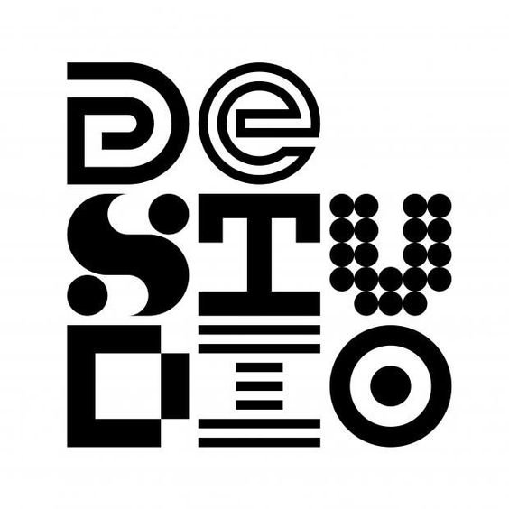
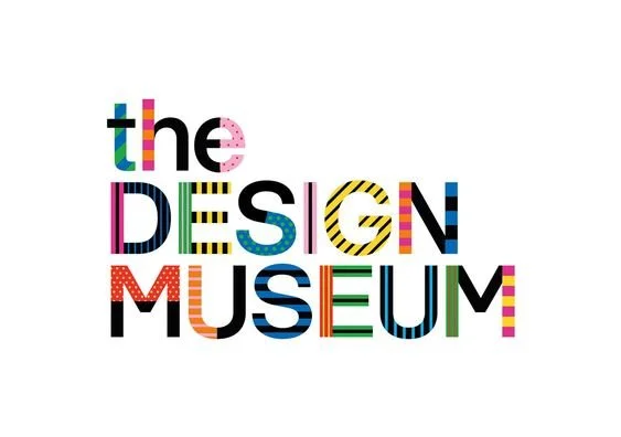
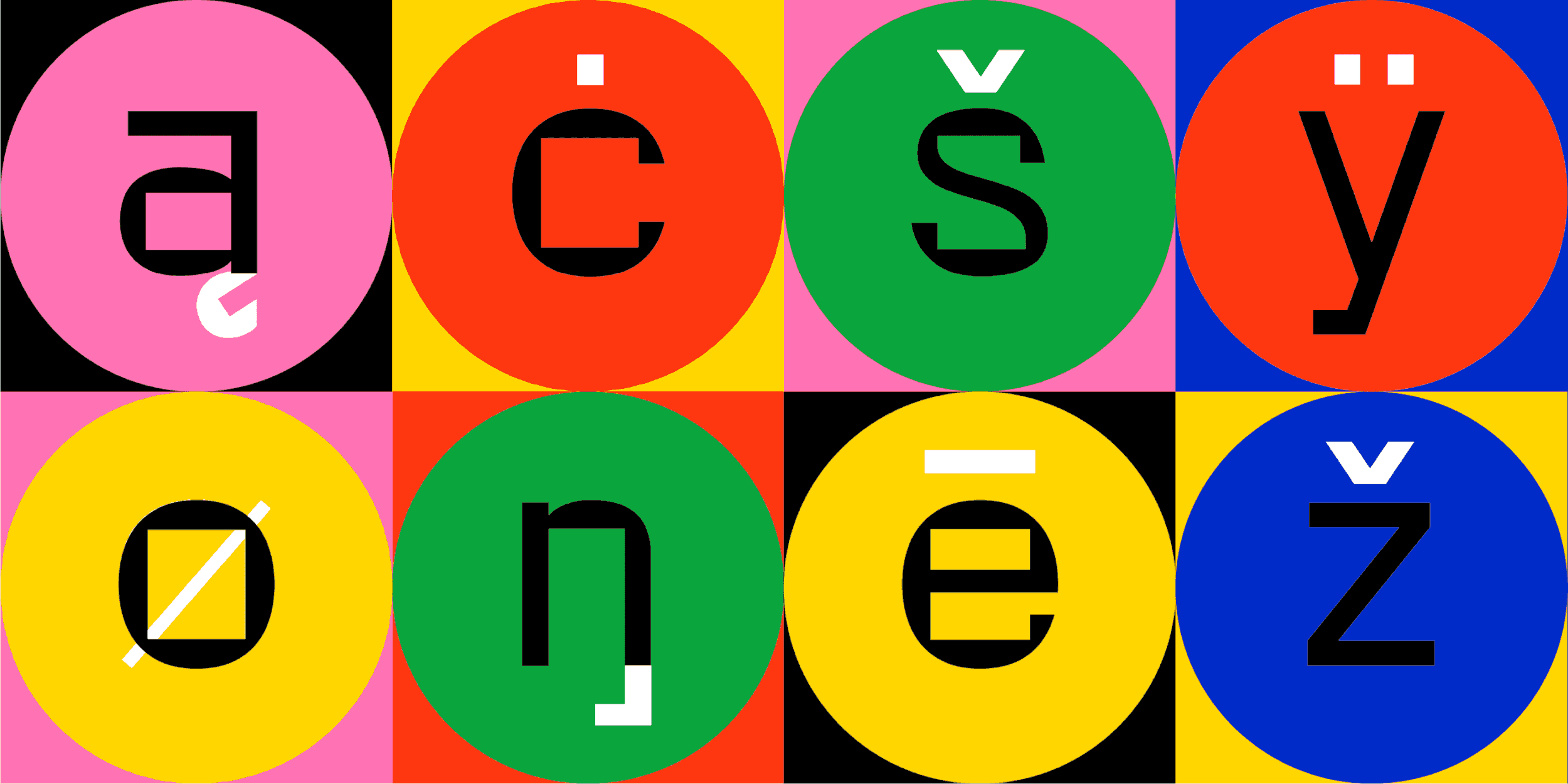
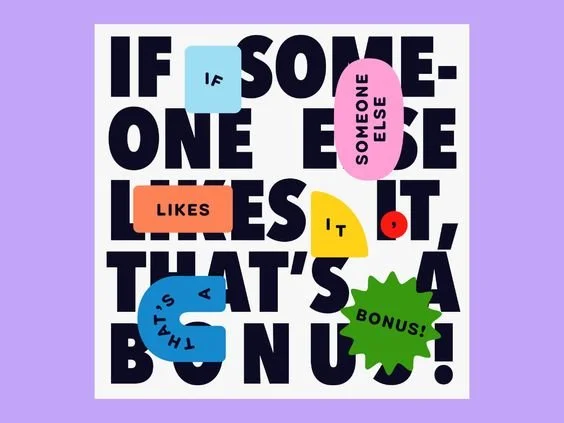
Some mood board picks!
-
![]()
-
![]()
-
![]()